
PS FOURNIER
A French classic revived by Stéphane Elbaz in three optical sizes & 42 cuts.
Available now at Typofonderie.com
Available now at Typofonderie.com

PS FOURNIER, created by Stéphane Elbaz, is designed in tribute to Pierre-Simon Fournier. Fournier was the prolific Parisian type designer whose work is best known for its iconic representation of French transitional style. PS Fournier elegantly represents the transition to the modern era of typography. Featuring three optical sizes, PS Fournier is designed to perform in any context.


The 42 styles of the PS Fournier family include romans and italics, with weights ranging from Light to Black, and 3 optical sizes to accommodate a large diversity of uses. With a close look at the family, you’ll find that the difference between the optical sizes (Petit, Standard and Grand) is more than a contrast variation between the thin and the thick; the eye can also denote a palette of distinct tones: More streamlined and robust in the smaller sizes (Petit), more refined and detailed in the larger sizes (Grand).


by André Jammes
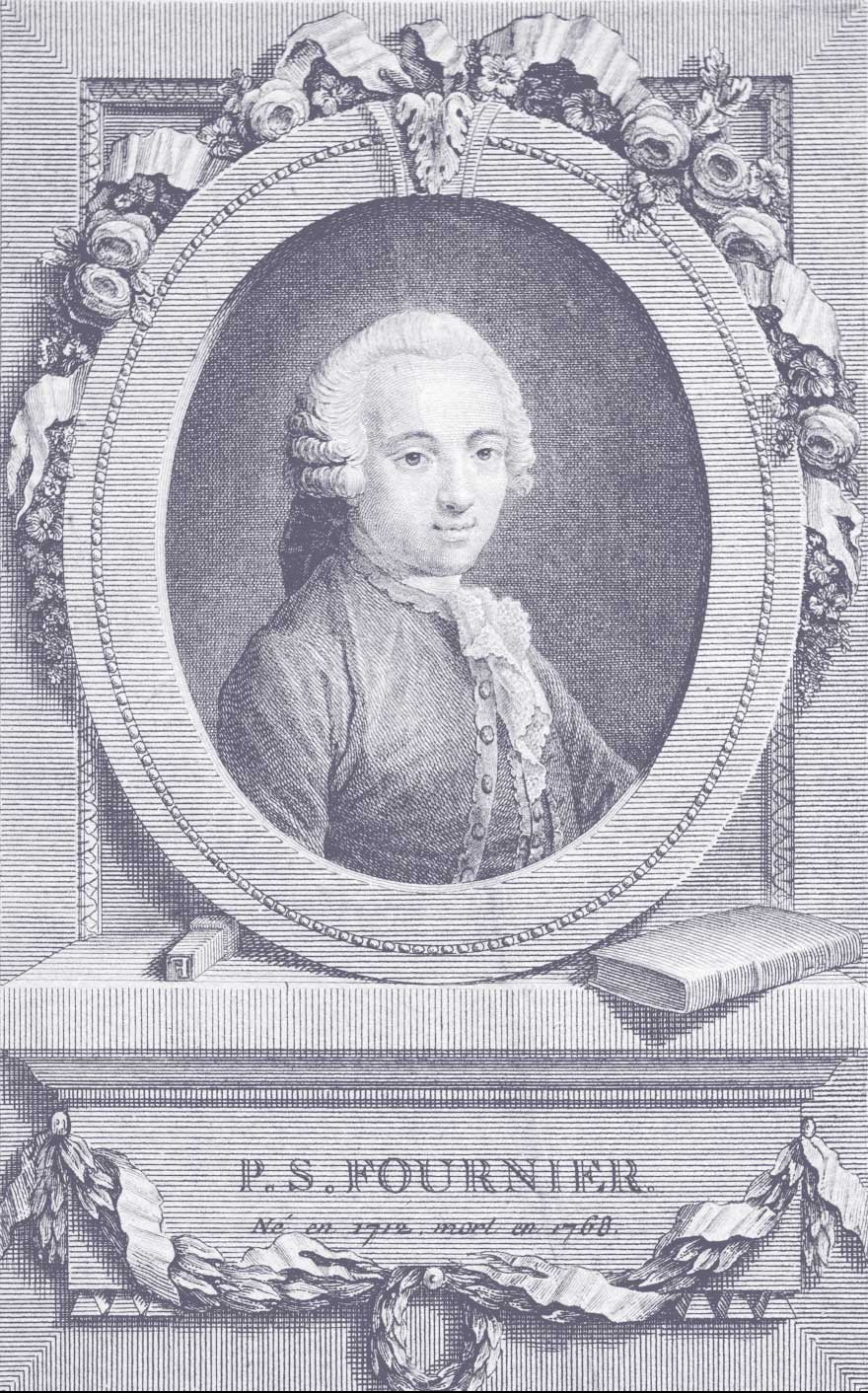
“Pierre-Simon Fournier, punchcutter and typefounder, was born in Paris on September 16th 1712, by parents whose probity amply compensated for their lack of wealth”. This quote from the author of Éloge de Monsieur Fournier le Jeune, was published two years following the death of Pierre-Simon Fournier in 1768.† The necrologic statement was in part inspired by Mr Bejot, keeper of manuscripts from the King’s Library, who, “had been Mr. Fournier le Jeune’s friend for close to thirty years”. This bond of friendship had opened him the doors to this glorious institution, allowing him to consult some of France’s most precious manuscripts. His studies on the first impressions of Mayence and Strasbourg lead him toward the other Parisian libraries. He then continued on to visit the libraries of Mazarine, Bénédictins de Saint-Germain-des-Prés, the abbey of Saint-Victor, the collections of Sorbonne, and the Célestins, the remarkable Jesuit library, shortly prior to his dispersion, and was introduced to Gaignat, the infamous collector, and was allowed the opportunity to examine the first products of print at the Président de Cotte.
His familiarity with librarians and attentive study of books and their fabrication made Fournier a unique expert in his profession. The importance of his research appears in the treaties and dissertations he published between 1758 and 1766 on wooden etchings, the origins of printing, musical printing, etc. All this erudition work was destined to fulfill a punch cutting practice he’d inaugurated with the family foundry his elder brother had inherited. It was a historic endeavour where a formidable collection of typefaces, matrices and punches had been established, all of which had been inherited and acquired from masters of typography such as Augereau, Garamont, Granjon, Le Bé and Sanlecque. These objects were that of jewelry to Fournier; they represented a physical contact to masters of the past and a source of invigorating inspiration. The family foundry however remained in the hands of his brother, Jean-Pierre (born in 1707), which is why Pierre-Simon decided to later create his own company.
Fournier’s work is immense: over a hundred different kinds of roman and italic cuts, as well as Greek types and the musical fonts, 377 new ornaments, display faces, etc. The Typographic Manuel published from 1764 to 1768, was a brilliant exposé of his work: thousands of punches, almost all created of his own hand. The first volume was composed and printed by Fournier himself, the second was, for corporate reasons, pulled into Barbou’s printing house, who was a close friend of Fournier’s and his family. These two volumes, as well as the full body of his writings published under the title of “Historic treaties” between 1758 a 1763, are some of the most elegant books of the 18th century, and have always been highly regarded by bibliophiles. Fournier was also a master composer, designer and printer, and was highly conscious of his merits; in the preliminary warning of his Manuel, he declared rather proudly “He who engraves or cut type punches is a PUNCHCUTTER; he who casts is a TYPE FOUNDER and he who prints is a PRINTER; only those who can unite the science of these three pieces however can call themselves a TYPOGRAPHER. There have been few artists of the first type, more of the second, a lot of the third, and very few of the fourth, that is, who have merited the title of Typographer.”
Harry Carter, who is known for his often harsh judgments, says the same thing “His grasp of typography was so complete and so firm that he could venture into every corner of it, its literature, its history, its relation to greater things, writing, architecture, music. He was as much an artist as a mechanic, and to a less extent a man of letters.”‡
The historical research that lead Fournier to studying the first fonts of roman types of Mentelin at Strasbourg as well as the manuscripts of Jarry for Louis the 14th, allowed him to have a global vision of his art. His work is a reflection of this; an admirable synthesis of roman typography. There have of course been other beautiful roman types since the 15th century where one can often find a delightful hint of medieval times or the reflection of their Italian, British or Italian sources, but for Stéphane Elbaz, the goal was to create a global typeface all whilst conserving the refined and discreet elegance of the French 18th century.
In publishing the PS Fournier, Stéphane Elbaz and Typofonderie are launching the first truly universal typeface into the digital domain.


